.svg)

Read time 6 min
- Share
-

-

-

Apple's foldable iPhone finally landed on 9 September 2026, and it's already causing a headache nobody saw coming. Not for phone reviewers, they've had a decade of Samsung Galaxy Z Folds to get used to the idea. The headache is for anyone who runs a website, because the iPhone Duo just handed millions of people a screen size the internet hasn't properly planned for.
Apple just announced a phone that unfolds into a mini tablet
The iPhone Duo has two screens. Closed, it's a 5.4 inch phone, close to the footprint of an iPhone Mini. Unfolded, that same phone becomes a 7.6 inch display, roughly the size of a paperback novel and noticeably bigger than any "phone" screen your website has previously had reason to think about.
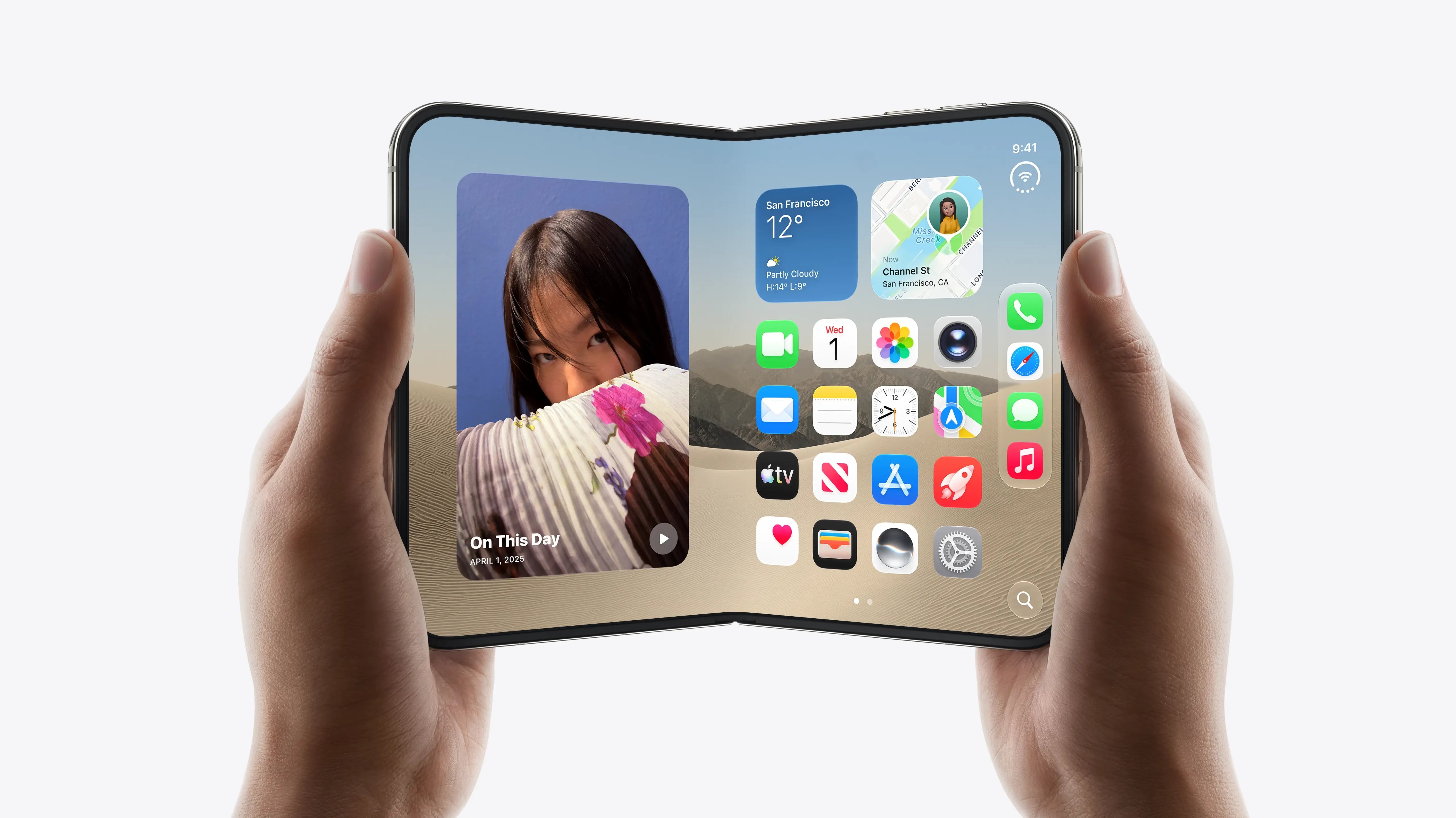 Image source: Apple.
Samsung has sold folding phones for years, so in one sense this isn't new. What's new is scale. Apple sells more phones in Australia than any other brand, and every one of those buyers is about to become someone who might browse your business on a screen that's neither a phone nor a tablet. It's the difference between a niche size a handful of designers tested for out of thoroughness, and a size millions of ordinary customers are now genuinely holding.
A quick refresher on what a breakpoint actually is
If you've never had a conversation with a developer about "breakpoints", here's the two minute version. Most websites are built to look right at a handful of fixed widths, roughly phone, tablet and desktop. At each width, the layout changes, the menu collapses into a hamburger icon, columns stack on top of each other, images resize.
Think of it like a shirt that only comes in small, medium and large. Most people fit reasonably well into one of the three. But every now and then someone comes along built exactly between two sizes, and the shirt that's supposed to fit them either gapes at the shoulders or strains at the buttons. Nobody designed for that in-between body shape on purpose, it's just where the sizing chart runs out.
The iPhone Duo, unfolded, is exactly that in-between body shape for your website.
 Image source: Apple.
Why the fold sits right in the awkward middle
Most responsive websites jump from a "mobile" layout somewhere around 480 pixels wide, straight to a "tablet" layout around 768 to 1024 pixels. The iPhone Duo's unfolded screen lands right in that gap. Depending on how your site is built, that means one of two things happens the moment someone opens it on their newly unfolded phone.
Either your site decides they're still "on mobile" and serves them a phone layout stretched across a much bigger screen, oversized buttons, huge gaps of empty space, text that looks like it's been left in the dryer too long. Or it decides they've crossed into "tablet" territory and serves them a squeezed-down desktop layout, dense navigation and small tap targets designed for a mouse pointer, now sitting under someone's thumb.
Neither is technically broken. Both just look like nobody thought about them, which, until this week, nobody really had to.
Your website isn't the only thing that has to fall in line
Websites aren't the only casualty here. Every app on your phone just received the same instruction, whether its makers wanted it or not. Banking apps, food delivery apps, whatever app your own business runs, all of them were built around a screen shaped roughly like a phone, and all of them now have to decide what happens when that screen doubles in width partway through someone using it.
The big names probably saw this coming. Apple gives its largest developer partners early access to test hardware under strict non-disclosure well before a major shift like this, so an app like Instagram or your banking app likely had updated layouts ready before the announcement even happened. Everyone else, every small business running its own app, every developer without a direct line to Cupertino, found out at exactly the same moment as the rest of us and starts rebuilding from here.
And that's really the point worth sitting with, longer than the news cycle will let you. Apple didn't ask permission. It decided, on its own timeline, for its own commercial reasons, that phones can now be a different shape, and every business with anything living on a phone, a website, an app, a checkout flow, had to respond whether it was ready or not. You don't get a vote when a platform you don't own decides to change the furniture. Not with Apple, not with Google's search algorithm, not with Meta's ad platform. The only thing actually in your control is whether what you've built is flexible enough to move with those changes, or brittle enough to crack every time one lands.
This was never really about one phone
Here's the other bit worth sitting with. The iPhone Duo is the headline, but it's a symptom of something that's been building for a while, the line between "mobile journey" and "desktop journey" has been blurring for years, and most websites are still built as if customers cleanly sort themselves into one camp or the other.
People already research on their phone during a commute, compare options on a tablet on the couch, then complete a purchase or fill out a form at a desktop the next morning, sometimes all for the same decision. A foldable phone just makes that blur physical, one device, two very different screen shapes, used minutes apart. If your website only really works at three fixed sizes, you were already leaking a bit of trust from customers on unusual devices. The iPhone Duo just made the gap wide enough to notice.
The five minute audit you can run today
You don't need a developer standing by to check where you stand. Open your website, then slowly drag the edge of your browser window narrower and narrower, watching the whole time rather than jumping straight to checking it on your phone. Watch for the moment the layout changes, and pay particular attention to the ten or so pixels either side of that change. That messy zone either side of every breakpoint is exactly where an in-between screen like the iPhone Duo's unfolded display will land.
As you go, keep an eye on three things specifically: whether your navigation becomes unusable rather than just different, whether buttons and links stay big enough to tap comfortably rather than shrinking to mouse-sized targets, and whether any images or text get awkwardly cropped or stretched in that middle ground.
What "responsive" should really mean from here
The honest fix isn't "add one new breakpoint for foldable phones", because next year there will be another odd screen size, and the year after that another one. The more durable fix is building websites that flex continuously between sizes rather than snapping between three or four fixed states, so there's no awkward middle for any screen to fall into in the first place.
That's a bigger conversation than most business owners want to have about their website, fair enough, but it's worth knowing the difference exists next time you're briefing a redesign. A site built to genuinely flex will handle whatever screen shape Apple, Samsung or anyone else dreams up next. A site built around three fixed sizes will keep getting caught out, one new device launch at a time.
Quick answers
What is a breakpoint in web design?
A breakpoint is a screen width where a website's layout deliberately changes, for example when a menu collapses into a hamburger icon or columns stack vertically instead of sitting side by side. Most sites use three or four breakpoints, tuned around phone, tablet and desktop screen sizes.
Do I need to redesign my website because of the iPhone Duo?
Probably not a full redesign, but it's a good reason to check how your site behaves at screen widths between about 600 and 800 pixels, which is where the iPhone Duo's unfolded 7.6 inch display sits. If it already looks fine there, you're ahead of most.
What screen size is the iPhone Duo?
Apple's official specs list a 5.4 inch outer display when the phone is closed, and a 7.6 inch display once unfolded, both Super Retina XDR OLED with ProMotion. The unfolded size sits between a typical phone and a small tablet.
How do I test my website on different screen sizes?
The simplest check is dragging your browser window narrower while watching the layout live, but for a proper look, most browsers include a "device toolbar" or "responsive design mode" in their developer tools, letting you preview specific widths, including the in-between sizes most templates never get tested against.
Do apps need to be updated for the iPhone Duo too?
Yes. Any app built assuming a phone-shaped screen has to account for a display that can suddenly double in width mid-session. Large developers with early access to Apple's hardware likely had updates ready at launch, smaller apps and in-house business tools are only starting that work now.
The bottom line
Apple didn't set out to break anyone's website. But by putting a genuinely new screen size into millions of Australian pockets with one announcement, it's handed every business a free, slightly cheeky reminder of two things: check whether your site actually flexes rather than quietly hoping every customer's screen matches one of the three sizes it was designed for, and remember that you don't get a say in when the ground shifts, only in how well you've built for the day it does.
Share