.svg)

Read time 4 min
- Share
-

-

-

Having a website and having a website that converts customers are two very different things. You could have the best product or service in the world, but if your website doesn’t reflect that, your potential customers will go to someone else who does. Like having a car that doesn’t have wheels, yeah you have a car, but it doesn’t really do what it’s supposed to.
Every year, new web design trends claim to produce the highest conversions. But before you go and start tweaking portions of your website, you should examine the evidence first and go for trends backed by statistics.
A solid web design is crucial because you only have 50 milliseconds to make a first impression on a customer. Since 3 out of 4 visitors judge a website’s credibility based on looks, having an attractive and functional web design is essential for conversion.
Here are five website design tips that will help convert visitors to customers.
High-Converting Web Designs
These web design tips are quick to implement and proven to increase conversions.
Design Tip #1: Mobile-First Design
In today’s world, people are using their phones for essentially everything. From checking the weather to ordering takeout, people are doing more on their phones than ever. And that includes buying products and services.
In fact, 67% of customers say they are more likely to buy from a mobile-friendly site. So, what does that mean for you? Your website needs to be designed with mobile users in mind, which means a clean design with easy-to-click buttons and links. Mobile-first design is no longer an option; it’s necessary if you want to convert customers.
A word of caution, however. Before revamping your site, ensure you understand your target customer first. There are some industries where customers engage better with desktop versions. To be safe, aim for a clean and responsive website that works well for mobile and desktop.
Design Tip #2: Use Contrasting Colours
When it comes to web design, contrast is key. You want to use colours that will pop against each other and grab attention. That doesn’t mean you have to use neon colours, as that would probably do more harm than good, but it does mean choosing colours that complement each other well. Striking a balance is essential since 21% of consumers leave a website with outlandish colours.
When choosing colours, consider your brand’s colour scheme. It should be reflected across the site, especially if customers already have an affinity for your brand. Using your brand’s colour scheme increases your credibility because of brand consistency.
A website with contrasting colours that draw attention to the call-to-action button.
Another way to create contrast on your website is through the use of whitespace. Whitespace is the empty space on a page, and utilising it correctly can make a big impact. Too much whitespace can make a website look unfinished, but too little can make it look cluttered and messy. Although only 8% of visitors notice whitespace, it’s a critical web design element that helps focus attention on CTAs and other essential web elements.
Design Tip #3: Use High-Quality Images
People are visual creatures, and we respond well to visual cues - that’s why using high-quality images on your website is so important. People are more likely to remember something they see than something they read, so using images is a great way to appeal to potential customers and get your message across.
But using any old image won’t do; you need to use images that are high quality and relevant to your product or service. Otherwise, you risk turning people off from your business altogether. High-quality images are essential to any good web design strategy to convert customers.
However, be mindful of image loading times. Visitors have short attention spans and won’t wait for an image that’s taking forever to load. Use image compression tools to reduce image size without sacrificing quality. Reducing page load times by just one-tenth of a second boosts conversion rates by as much as 10% for some industries.
Design Tip #4: Keep Things Simple
Most newbie website owners want to showcase all their product’s unique features and benefits on one page. They use a lot of text, images, pop-ups, and long forms to convey their brand promise and get visitors to convert. While it’s great that your product has tons of features, it’s overwhelming for your visitors.
More than 80% of web designers believe a cluttered website is a common mistake. Keep things simple and help your visitors get the information they need in the shortest time possible. This includes reducing annoying pop-ups, creating shorter forms, eliminating distracting images, and creating intuitive navigation.
Nobody really likes annoying pop-ups.
Always follow the three-click rule. Visitors should be able to find what they need after three clicks. Avoid long-winding menu items and keep titles descriptive but short. Also, don’t try to cram multiple items on your menus. Instead, use a prominent search bar to help customers find the exact information they need.
Design Tip #5: Emphasize Your Call-To-Action
When designing a website, it is important to consider the ultimate goal of your business and how the design can support that objective. The call-to-action tells your customer what to do next. This could be signing up for a newsletter, filling out a contact form, or purchasing a product.
Unfortunately, not having a clear call-to-action is another common mistake that website owners make. Without a strong call-to-action, customers may not know how to take the next step and engage with your business. Avoid using too many call-to-actions on one page since those can be confusing. Ideally, each page should only have one call-to-action in a central section.
Whatever your specific call to action may be, it is crucial to make it clear and visually emphasised on the website. This means using bold colours, relevant imagery, and prominent placement on the page. Make sure to focus on this aspect of web design to convert visitors into customers effectively.
Bottomline
These days, having just any old website isn’t enough—you need a website designed to convert visitors into paying customers. And while many elements go into designing a website that converts, these tips are a great place to start. They will help you create a web design that will help convert visitors into loyal customers.
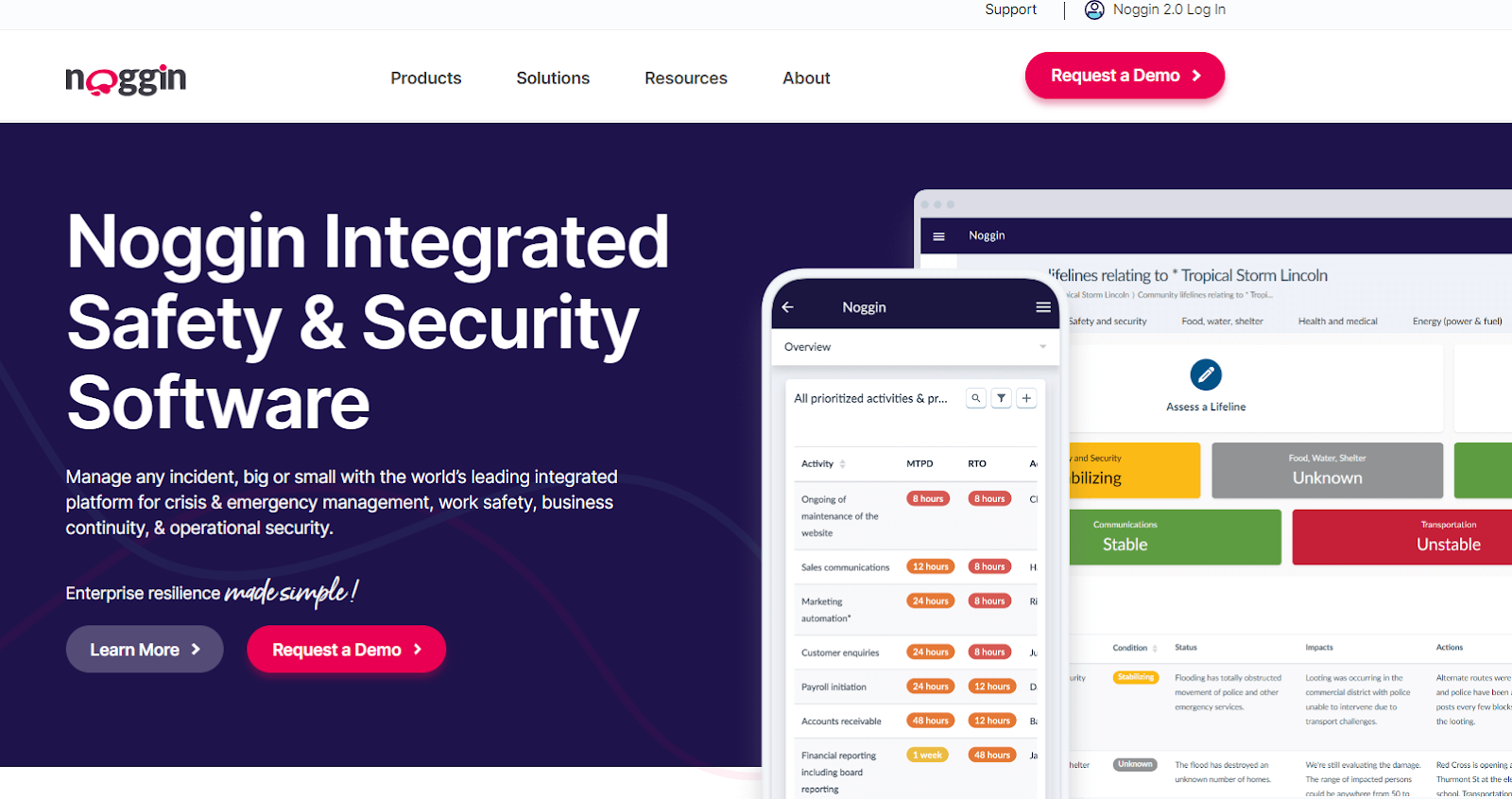
Want to see these tips in action? Check out how we created a high-converting website for a security software company that increased their conversions by 5.4x.

Share


.svg)