.svg)

Read time 5 min
- Share
-

-

-

Every website lives or dies on its imagery. You can write the sharpest copy in the country, but if the photo next to it is a blurry office selfie taken under fluorescent lights, nobody's sticking around to read the copy anyway. Good news: you don't need a Hollywood crew to get this right. You need a plan.
That plan has a name, and it's the difference between a productive shoot and an expensive game of "just wing it": the shot list.
Start with a shot list, not a camera
A shot list is exactly what it sounds like: a written plan of every image and clip you need before anyone picks up a camera. Think of it as the recipe before the cooking. Nobody good in the kitchen starts by throwing things in a pan and hoping for the best, and nobody good behind a lens starts a shoot without knowing what they're there to capture.
Your shot list should cover the essentials every small business website needs:
- Headshots - clean, approachable, well-lit portraits of the owner, leadership, or anyone client-facing.
- Team and culture shots - people actually doing the work, not posing around a laptop that isn't even switched on.
- Product or service in action - proof, not promises.
- Lifestyle shots - the emotional connective tissue between your brand and the person scrolling.
- Hero and banner shots - wide, spacious images built to carry headlines and navigation without a fight.
Most professional photographers and videographers will build this list with you, and honestly, you want them to. It's the cheapest insurance policy in the entire project. An hour spent agreeing on shots beforehand saves a full re-shoot after someone realises there's no usable image for the homepage banner.
Composition: portrait or landscape depends on where the image lives, not on what looks nice in the moment
This is where a lot of otherwise good shoots go sideways. Someone shoots everything in portrait because that's how their phone naturally sits in their hand, and then the web designer is left trying to cram a tall, narrow photo into a wide homepage banner. As any guide to orientation will tell you, it doesn't work. It never works.
The rule of thumb: decide the destination before you decide the orientation.
- Landscape (16:9) suits hero banners, desktop backgrounds, and anything that needs to stretch full-width across a screen.
- Portrait (9:16) suits mobile-first content, Instagram Reels, TikTok, and vertical galleries.
- Square (1:1) is the safe middle ground for team grids and product thumbnails that need to sit neatly in a layout.
If your website audience is largely on mobile (check your analytics, don't guess), make sure the shot list reflects that. Most phone usage happens in a vertical grip, so a gorgeous landscape shot can look like a postage stamp on a phone screen, and cropping it later is a bit like tailoring a suit with garden shears.
Negative space: give your website room to breathe
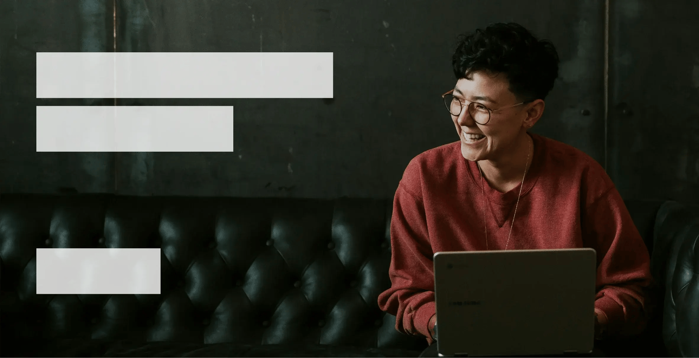
Negative space is the empty area around your subject, the sky above a person's head, the blank wall beside a product, the quiet corner of a room. It feels like wasted space until you realise it's actually doing a job: it's where your web designer puts the headline, the logo, or the call-to-action button.
A photo with no breathing room forces a designer to slap text over someone's face, which never ends well for anyone involved. A photo with generous negative space gives the layout somewhere to land.
A few ways to build this in:
- Shoot wide, and crop tighter later rather than the other way around.
- Position your subject off-centre rather than dead in the middle, it looks more intentional and leaves a clear run for text.
- Look for naturally plain backdrops: a clear sky, a painted wall, an out-of-focus office.
Done well, negative space transforms how a brand reads online. Think of it as the pause in a good sentence. Remove all the pauses and the whole thing becomes noise.
Colour and styling: your brand doesn't stop at the logo
Here's a question worth asking before the shoot, not during it: if your brand colour is red, your logo is red, and every call-to-action button on your site is red, should the person in the photo be wearing red too?
Usually, no. If your subject is head-to-toe in the same red as your CTA buttons, one of two things happens. Either the outfit fights the button for attention, or the whole photo starts to look like it's wearing a uniform for a brand that doesn't exist yet. A better approach is to treat your brand colour as the accent, not the outfit: a single item, a small prop, a detail in the background, something that nods to the palette without competing with it.
And colour is only the start. Your brand doesn't just sit on your logo, it flows into everything the camera sees. Are you relaxed in sandals, or buttoned up in a suit? Is the office clean and minimal, or warm and cluttered with personality? Every one of those choices tells the viewer something about who you are before they've read a single word of copy.
Before the shoot, walk through:
- Wardrobe - does it match the tone of the brand (approachable, corporate, playful, premium), and does it avoid clashing head-on with your primary brand colour?
- Location and props - do they reinforce the brand's personality, or quietly contradict it?
- Consistency across people - if multiple team members are being shot, is there a loose styling guide so the whole set feels like one brand, not five different ones?
Add a line to your shot list for this. "Wardrobe: navy or neutral, one accent item in brand blue" takes ten seconds to write and saves a full re-shoot when someone turns up in clashing colours.
Video follows the same rules, with a few extras
Video for your website should be planned exactly like your photos, with a shot list, a sense of orientation, and an eye for negative space in every frame. A few video-specific notes worth flagging with your videographer:
- Shoot in the highest resolution sensible for your budget (4K gives you flexibility to crop and stabilise later).
- Match your frame rate to your goal: 24fps for a more cinematic feel, 30fps for standard web content.
- Stabilise everything. Handheld wobble reads as "amateur" faster than almost any other flaw.
- Capture some quiet, static B-roll alongside the main footage. It's the negative space of video, and it gives editors somewhere to breathe between cuts.
Working with a photographer or videographer
The best photographers and videographers won't just turn up and start shooting. They'll want to sit down with you first, understand the brand, and build the shot list together. If someone offers to skip that step, take it as a warning sign rather than a time saving.
It's the same philosophy the teams we rate stand on. Casual Films, a global video production studio, build every project on what they call narrative science: nothing goes to camera until the story, the look, and the reason behind each shot is agreed on paper. Closer to home, Sydney's Ascend Studios run the same way for their video and photo clients, planning the shoot around the brand before a single frame is captured. Whoever you end up working with, look for that same instinct: plan first, shoot second.
Come to that planning conversation with:
- Your website's page structure (so you know exactly what needs imagery, and where).
- Examples of styles or shots you like (screenshots are fine, nobody expects a mood board from a design agency).
- A rough sense of who's in front of the camera and when they're available.
The quick pre-shoot checklist
Before the day arrives, make sure you've locked in:
- A written shot list, agreed with your photographer or videographer.
- Orientation decided per shot, based on where each image or clip will actually live on the site.
- A plan for negative space around key subjects, especially anything destined for a hero banner.
- Wardrobe, props, and locations confirmed in advance, checked against your brand colours and overall personality, not just what looks good on the day.
- A backup plan for lighting and weather, because plans A and B rarely fail on the same day.
Get the plan right, and the camera does the easy part. Skip it, and no amount of clever editing will save a shoot that never had a destination in mind. Ai is good, but sometimes, it's easier to point and shoot.
Need a hand briefing your next photo or video shoot, or want help turning the results into a website that actually converts? That's exactly the kind of thing we do at Thirtyfour Creative.
Share


.svg)